August 15, 2023

Minimal Alphabet

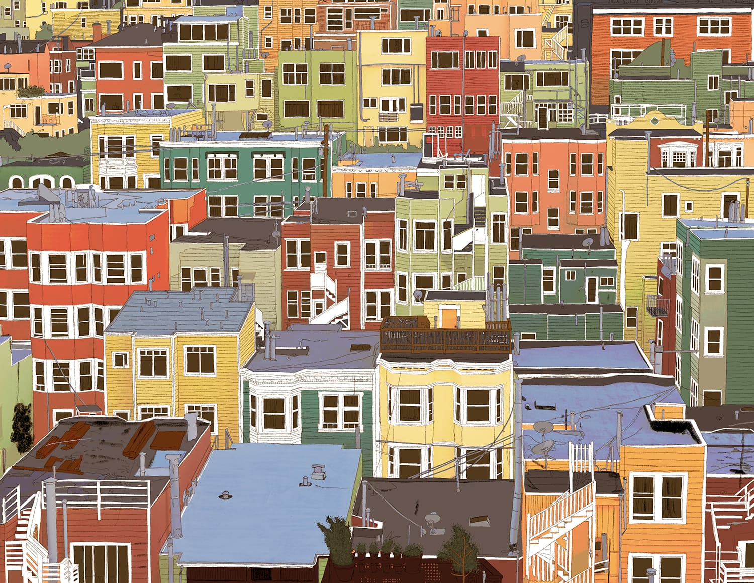
The other night I wanted to see if I could design a type face as minimally as possible. Starting with a base rectangle and seeing how I could distinguish each letterform with as few visual cues as possible. This was what I cam up with in my first 2 hour pass. I see a few things I'd maybe have done differently now, but as a thought experiment I think it shows what's possible.

I know more than a few people have tested their own minimal fonts/typography against the word minimum as well because of the similar letterforms so I thought it was a good test for this as well.

August 14, 2023

The Remix Edition

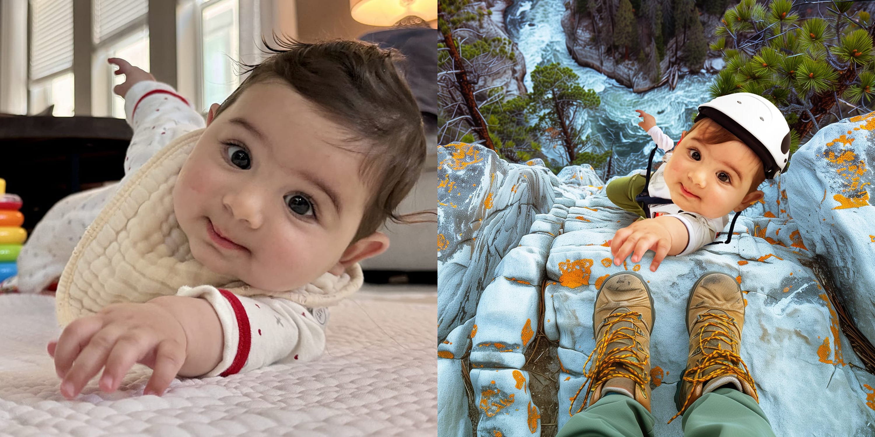
The other night I had a thought about how my wife and I are dropping a remix and what the tracks would be, all alluding to our incoming baby. Went ahead and mocked up the album art. I used a photo I shot of us when we were in Portland last summer. When I overlaid one of the ultrasounds, I realized it looked like either a scratch or a reflection and either way I liked it. Enjoy.

August 8, 2023

Baby Shower Invite

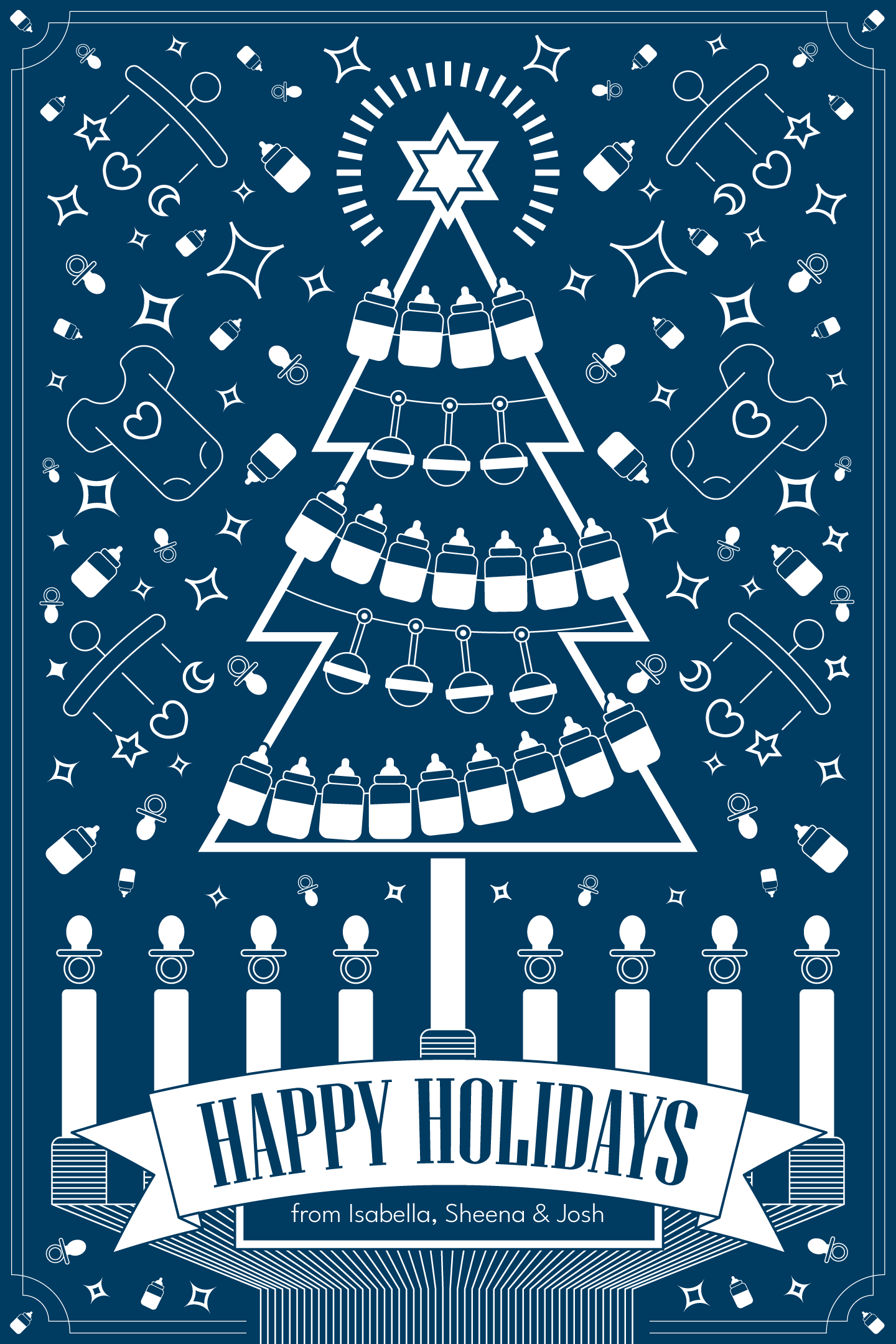
I designed the invite for my wife's baby shower a few weeks ago. I'm pretty happy with how it turned out.

I made all the elements except the base font for the type. However, I did customize it a bit using some of the glyphs and then going in and removing parts of letters as accents so the glyphs would read better.

August 7, 2023

FreeLAnce Drinks

I've been working with Stephen Reidmiller to host a happy hour for freelance creatives in Los Angeles. Tomorrow is the first one and to that end we created some social assets to help advertise it. Whenever you're building a brand from scratch, no matter how small, it's an interesting exercise in figuring out what makes the most sense for the people you are trying to talk to. Especially creatives who are going to be ultra judgy about whatever you post.

The first post needed to be the most basic. It was a new idea and we were posting 2 weeks before the event so we needed to spoon feed what to expect a bit more. Whenever I teach classes I always tell my students that the journalistic 5 W's actually make a great brief: who, what, where, when, why. You don't need much more than that honestly. I employed it here as well.

Who: Advertising Creatives
What: Happy Hour Drinks
Where: Los Angeles
When: Aug 8th @ 7pm
Why: To meet other freelancers

As mentioned, since this was the first communication I made the decision to have the visual be more simplistic. Emphasize the drinking part of what we are doing and let the subhead be more playful.

I also wanted vibrant, bright colors to stand out on LinkedIn which tends to be more drab.

The second post gave us some room to play. With the idea already established and a week before the vent, we used the design language from the first post. Same fonts and layout which works well for LinkedIn's preferred aspect ratio. The preferred aspect ratio is important even though if you upload something different because when you share the post, it'll pull the image.

You aren't really dropping the image for the feed, you're designing for the share. If you're outside the aspect ratio, the image will get cropped which isn't great if you are trying to exercise the most amount of control over what you are making.

We decided to get a little meta with the visual, showing someone working at a bar on the graphic that is actually showing in the feed. And on the screen we can see they are working on the same in the same. Again, subhead is fun and should appeal to our target audience, freelance creatives who will thus understand what a day rate means and infers.

Our final post ran today, a day before the event. We wanted to reinforce the core idea that this is a social event while also playing with some of the absurdities freelancers are familiar with, requiring people to be on-site when it's not necessary most of the time. In this case, repurposing that language and showing the affect of what being remote to a social event would look like.

We'll see how many people show up but the response has been good. Honestly, my guess is 10-20 people. I'll be pleasantly surprised if more than that come but you never know.

August 5, 2023

Free Headshots

The other week I made an offer on LinkedIn to take free headshots of any out-of-work creatives who wanted a refresh. I only had one person take me up, so everyone else's loss. Brandi and I met up this past Wednesday over in Santa Monica and these were the results.

August 4, 2023

Family Matters

With the baby coming soon, I took some time to reflect on what it meant for my career. Seems to have resonated a bit.

July 19, 2023

r/cats

I posted a photo of Killbot's Paw Mitzvah portrait on Reddit's r/cats and it made it to the number one spot last night. It now has over 5k upvotes. Weird times.

July 10, 2023

Creative Kitchen

I'd been preaching the virtues of kitchen communication to my students for awhile, but while I was watching The Bear the other week I was able to add a new parallel to the comparison. I ended up writing about it and, well, apparently it resonated.

June 12, 2023

Paw Mitzvah

My cat Killbot 3000 is turning 13 next month so I decided to throw him a Paw Mitzvah. In reality it's just an excuse to grill out some food for friends, but how memorable is that? I also thought it would be a fun chance to play with Photoshop's new Generative Fill to see what I could make.

Below is a before and after so you can see what I did fairly quickly. The main thing I had to do manually was add in the Hebrew to the book along with the image on the page. AI still hasn't figure out how to do that stuff well yet.

May 29, 2023

Special Delivery

When my wife and I decided to start trying for a child, I had an idea for an announcement based on her most common delivery order. In late December we found out she was pregnant so I mocked it up and sat on it. Today she finally got the go ahead to post on social media so I get to post here as well.

May 5, 2023

Awwwards

The Encyclawpedia Dictatia has won an Honorable Mention from The Awwwards. This is the first step towards a possible Site of the Day Honor.

May 5, 2023

The Milken Cookies

While driving through the Sepulveda Pass in Los Angeles I noticed a school on my GPS called "The Milken Community School." Without any knowledge of the school I immediately imagined a new mascot for them, "The Milken Cookies." With the help of Midjourney, I designed their new mascot in the style of an NFL team logo. You can see the results below.